Kenji Watanabe Special Interview
渡辺けんじスペシャルインタビュー
Taken from: Digital Monster Art Book Ver.1~5&20th
デジタルモンスター ART BOOK Ver.1~5&20th
Joining the Company – A Stage of Trial and Error
– Before we talk about Digimon, we would like to take the opportunity to find out more about you. When did you decide to become a designer?
Watanabe: I had originally wanted to become a manga artist. Back when I was in high school, some of the manga I had drawn had been published in shonen magazines run by Shogakukan and Shueisha. My name even managed to appear in the magazines that I submitted my works to! But of course, I knew that as much as I wanted to become a mangaka, it wasn’t something that could happen overnight. As such, I wanted to pursue a formal education in art, and with some persuasion my parents allowed me to attend a school that specialised in design. There, as I studied illustration and conducted research on design companies, I was faced with the harsh reality of the industry… I began to think, since working in the industry is so tough, I’d prefer a job where I focus on finishing one illustration at a time. Illustration jobs weren’t very common, but occasionally, there would be job postings looking for character artists. At that moment, only WiZ was looking for male employees, so I went for the interview and got the position. Wiz had only been recently established then, so they were a small company of only about 4 people strong. They didn’t have anyone among their staff who could illustrate characters, which was why they were looking for someone who could.
– Were you tasked with producing character designs the moment you joined the company?
Watanabe: After I joined the company, we were doing all sorts of stuff for a few years; metallic coin banks, maze puzzle toys, game development and testing, package illustrations, instruction manual art, you name it. I’ve even been to a factory to observe the actual manufacturing process, and painted the products myself… I didn’t feel like an actual illustrator then, more like a person who does illustration, but also all those other odd jobs; though, that’s true of everyone in WiZ back then. Whether we would be able to go from the planning stage to development stage depended on the value of the company in charge of planning. Tamagotchi and Digimon would only begin about 10 years after that.
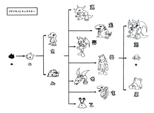
Taking Your Dinosaur for a Walk – An Interesting Experience
– Please tell us more about how the planning for the ‘Digital Monster’ toy began.
Watanabe: At that time, we were working with one of Bandai’s divisions, that is now called the Boy’s Toy Division, on developing the Tamagotchi. Because Tamagotchi gave off a strong impression that it was aimed at a female audience, we thought that we just had to make one that was aimed at boys, and thus began the planning. Since it was a Tamagotchi for boys, we had originally named it the Otokotchi¹; that name was changed to Capsule Zaurus² as we developed its contents further. However, the capsule idea would infringe on other companies’ products, so we ended up with the name Digital Monster, from the idea that they were ‘monsters that live through data’. When shortened, the name would become ‘Digimon’, and while we did discuss that that again almost infringes on the name of another company’s product, the trademark got accepted so I guess all’s well (laughs).
Since it was based off Tamagotchi, there were also a lot of cute designs among the monsters; we made monsters whose elemental affinities, such as fire, water, or electricity, were identifiable by their colours. However, that really was a bit too similar to that other company’s product, so I was asked to create brand new drawings for our product. Drawing inspiration from Spawn*¹, an American comic, as well as artists such as Simon Bisley*² and Mike Mignola*³, I added some little touches I was fond of back then while trying to draw illustrations aimed towards children, and that marked the start of Digimon illustration.
– Were you given any specifications to follow in regards to the direction to take with your illustrations?
Watanabe: I liked American comics to begin with, but it wasn’t a specification or anything; it’s not like I was told to “draw it in American comic style” (laughs). In any other situation, if I tried to draw anything before being given instructions, I’d probably just be scolded for drawing something different from what’s expected. But this was really a ‘what do we do now?’ kind of situation. We didn’t have much time left before the product was to go on sale, and everyone else had exhausted their ideas as well; not only that, we didn’t have any other illustrators on board at that time, so I was told to ‘draw as I see fit’. And so, the initial design we produced was this illustration, included in our proposal (pictured below).
(An image of Digimon, drawn by Kenji Watanabe)
Character designs weren’t as important during the development stage, so we would translate these initial designs into pixel art, and from there revise the character designs again. However, from Ver. 2 onwards we tended to do the pixel art first, though that isn’t true for all cases.
– Was the inclusion of the ‘Battle’ mechanic influenced by the monster designs?
Watanabe: I think the very fact that they were ‘monsters’ prompted the idea. We thought it would be interesting for children to raise their own monsters and dinosaurs, bring them for walks, and use them to battle one another, you know? I mean, what you’re actually taking around is just the pixel art, but that wouldn’t stop you from imagining the actual ‘dinosaurs’ fighting in your head. We thought seeing cute critters fighting felt a bit sad, so we decided to go for designs that looked more fearsome. Take dogs, for example; while they may be cute, once they open their mouths and show their teeth, they give off the vibe of a real ‘beast’ for a brief moment. That was the kind of animalistic fearsomeness I thought would be great to add into the designs.
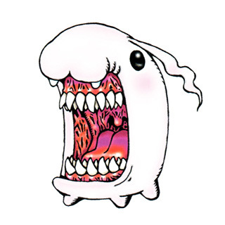
(Tokomon)
For example, you can see two rows of teeth when Tokomon opens its mouth. That was actually inspired by one of the creatures from the film The Dark Crystal*⁴ (more specifically Fizzgig, the pet of Kira, the heroine). So we thought it’d be a good idea to make something that had a cute apperance, but turns super scary the moment it opens its mouth. Looking back on it, I’m glad to have created this design.
– You mentioned previously that you would translate the finished pixel art into illustrated designs. What goes through your mind as you draw them?
Watanabe: During the making of Ver.1, I was given freedom to draw as I pleased. But from Ver.2, Ver.3 and onwards, I would first participate in an idea planning stage together with staff from WiZ, as well as Volcano Ota. Other staff could come and throw their ideas out too, and I would do the final collation and drawing. As the number of characters I had to draw increased, I was less able to decide what I wanted to draw solely on my own.
Volcano Ota is also able to draw and had produced many unorthodox ideas, so there were a lot of cases of me just putting and collating his ideas together. There was also a staff member who liked and was really particular about getting the references right, so they would research the various motifs thoroughly and tell me “Whatever you do, you musn’t leave this part out!”. It was a rather quirky behaviour (laughs), but I did take their words into consideration as I drew.
– Do you have any examples of Digimon that went through this process?
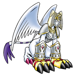
(Nefertimon) A Digimon that debuted in Digimon Adventure 02. Tailmon’s Armour Evolved form with the Digimental of Light.
Watanabe: While drawing Nefertimon, we had discussed about giving it a mask designed with mythological motifs in mind, so I would draw one and show them, asking “How’s this? Does it look cool?”. And they would reply “No, there’s something off about the vibe this mask gives!” and just wouldn’t give in (laughs). So I asked “What kind of vibe should I give the mask, then?”, to which they replied “The mask from Saint Seiya*⁵ might work” (laughs).
We also talked about how the illustrations from the Megami Tensei series*⁶ were really stylish and cool. A lot of the art had a really unique feel; sometimes you couldn’t tell if something was meant to be a god or a monster, and you would wonder where some of the motifs come from. Sometimes, I also got bursts of inspiration while looking through the games and media that were popular at the time. I thought having Digimon be monsters that were formed by taking data from various ‘mythologies’ or ‘animals’ was a nice idea. However, if I followed their mythological descriptions too closely, I’d just end up with something that looks like the designs already in other media out there, so I kept that in mind while designing. I think the resulting Digimon designs are quite rich in variation as a result.
These Are Not Illustrations – Drawing ‘Characters’
– Please tell us about the very first Digimon you drew.
Watanabe: That would be Tyranomon and Agumon. Since our initial idea was to be able to take ‘dinosaurs’ for a stroll, I used that idea as a base to design these two. That’s why they ended up on the package illustration as well. I often get asked “Why is Tyranomon on the cover?”, but that’s just because it’s the most normal-looking (laughs). I didn’t want to place the coolest, most important Digimon on the package illustration.
Tyranomon is, in a way, part of the normal evolutionary line; if you raised your Digimon well you’d get Greymon, while you’d get Numemon in the opposite case. The way the evolution lines split up is based on the Tamagotchi, but I wanted Digimon to portray the extremes even further, which made me design them how I did.
– What goes through your mind as you design Ultimate level Digimon?
Watanabe: I wouldn’t say I really keep much in mind as I design Ultimate levels. Either way though, they do tend to get full of details, resulting in a bit of a cluttered feeling. This direction is especially prevalent in my recent designs, so I have been told by various project leads to dial it down and keep it simple (laughs). It’s best to have a character that’s identifiable solely by their silhouette, and people should be able to tell what it’s supposed to be at first glance. Something that children can look at and try to imitate in their drawings. I strive to draw something that would receive praise not as an ‘illustration’, but as a ‘character’. For example, when people see a few simple belts and zippers and the dark shadows, they’ll immediately go “That’s definitely a Digimon”. That’s what I like to hear. Lately, I’ve been constantly told to keep it simple, even when designing Perfect or Adult levels.
Also, Digimon are ‘organisms’ at their core, so even when part of their body is mechanised, I try to cover their joints with cloth or something so that they can’t be seen. If even the joints are mechanised, the design would give off a more ‘robot’ feel instead, so I try to make the joints resemble flesh more.
(Hackmon)
Though, having said that, the detailed Hackmon line seems to have gone in the opposite direction from what I just mentioned (laughs), since I was focused on adding in details. Personally, Seabozu*⁷ was the motif I had in mind while drawing Hackmon. The image is basically that of a ‘bone dragon’; I had wanted to draw a skeletal dragon warrior, so I thought it would be interesting to use Seabozu as a base and gradually make it more warrior-like. I just really like Seabozu (laughs).
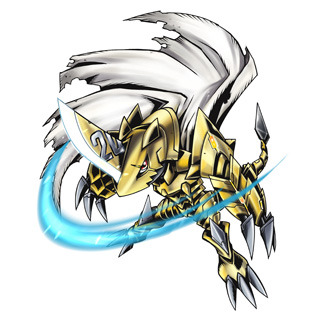
(Zubamon)
– How about the drawing of the 20th anniversary Digimon?
Watanabe: Zubamon was actually based off Omegamon. I do think that Omegamon helped to make Digimon popular, or at least contributed to making Digimon-related media explode in popularity, so it felt fitting to use for the 20th anniversary, which was a huge occasion. I wasn’t going for an ‘Omega-dragon’ design per se, but I did think about wanting to see how Omegamon would turn out in a more ‘dragon warrior’-like form, and so I drew a series of evolution lines. From there, we organised the ideas and came up with the theme of ‘Weapon Digimon’. That’s how Zubamon ended up with this powerful-looking appearance, despite only being a Child level.
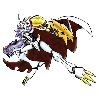
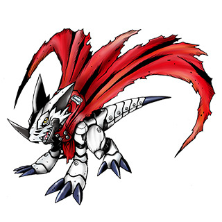
(Omegamon)
– Omegamon’s design really leaves a deep impression, doesn’t it?
Watanabe: Omegamon was designed only after the anime series had started airing, so it was a monster designed with various input and opinions I took from many people. The original design was simply a fusion of Wargreymon and Metalgarurumon’s parts, but I received several requests from the director, Mamoru Hosoda*⁸: “It’s a Digimon resulting from Taichi and Yamato’s thoughts becoming one, so I’d like to have elements of both of them included.” “Maybe something with a more simple feel?” “Maybe just stick the parts on the arms.” “Something sleeker!”. Finally, I came up with something that I wasn’t sure looked cool or not, but he said “This is it!” and decided on that design. When I first drew it, the design didn’t quite speak to me, but after seeing it in action on the big screen, I couldn’t help but feel awed at how cool it looked.
Digital Monster – From Here On Out
– What were your thoughts when you first heard that the Digital Monster Ver.20th would be made?
Watanabe: I was very grateful for the fact. I myself have been interviewed a quite few times lately; I used to consider myself someone who just worked in the background, and that only people who knew me would know who I was, but now I feel that it was worth staying on all this while. Looking at my old illustrations, some of which were drawn during desperate times, I would think about how I might design them differently now and even discover different ways I could’ve portrayed them. Even Agumon, for example; the way I draw it now is pretty different from how I drew it in the past, since I felt it might be better to give it a cuter look now. It’s these little interesting tidbits you start to realise only after you’ve been drawing for over 20 years.
While I like creating new characters, I’d also like to redraw all of the Digimon I’ve drawn before, to see how my characters have changed over these 20 years from my perspective.
– Aside from designing Digimon, do you have any other goals or visions for the future?
Watanabe: I’d like to see Digimon continue for another 20 years, but that aside, I also hope to make my characters more versatile as well. As mentioned earlier, by redrawing the characters I drew in the past, I hope to breathe new life into my past works and create new works in my own style, while treasuring my past works at the same time. However, I do think it’d be great to see more Digimon drawn by different people surface. In a way, it would be a testament to Digimon’s diversity, and I think it’d be interesting to see Digimon enter a new phase. This is especially true lately, as I’ve been thinking about how I hope for more younger people to join us, and take Digimon to new heights.
Profile
Kenji Watanabe 渡辺けんじ
Born in 1966, in the Kanagawa Prefecture, he is a character designer representing WOW FACTORY. Aside from Digimon, he has also worked on Tamagotchi, Legendz: Tale of the Dragon Kings, Yoikotchi, and other products/media.
Notes not marked with asterisks were added by me. Notes marked with asterisks were taken and translated from the interview itself.
¹Note: Otokotchi is a portmanteau of otoko (男), meaning ‘boy/male’ in Japanese, and Tamagotchi.
²Note: Capsule Zaurus is written カプセルザウルス in Japanese.
*¹Note: Spawn is an American comic series created by Todd McFarlane. It has made a big impact even in Japan, particularly through figurines.
*²Note: Simon Bisley is a British artist who worked on American comics. He is popular for his bold art style.
*³Note: Mike Mignola is an American comic artist whose unique deformed style and contrast are trademarks of his art. He has several titles he is famous for, including Hellboy.
*⁴Note: The Dark Crystal is a fantasy film released in 1982, directed by Jim Henson and Frank Oz.
*⁵Note: Saint Seiya is a manga by Masami Kurumada, designed with motifs taken from Greek mythology. It began its serialisation in the Weekly Shonen Jump in 1985.
*⁶Note: The Megami Tensei series is a series of video games that started with the game Digital Devil Story: Megami Tensei, released by Namco in 1987. The illustrator Kazuma Kaneko began to work on the series’ character designs starting with Digital Devil Story: Megami Tensei II.
*⁷Note: Seabozu, also named the Ghost Monster, debuted in episode 35 of Ultraman, titled The Monster Graveyard.
*⁸Note: Mamoru Hosoda was the director for Digimon Adventure (Movie), released in 1999, and Digimon Adventure: Our War Game, released in 2000.
